

We’ve all had a tough 2020 so it’s not surprising that we’re looking for a few creature comforts this winter.
Warm, grounded colours that speak of security and comfort are set to dominate winter decorating trends, according to Dulux trend forecasters.
“The cooler months call for richer hues and cosy textures, and never more so than in a year when most people’s worlds have been turned upside down,” says Andrea Lucena-Orr, Dulux colour and communications manager.
“There’s a collective yearning for reassurance and a return to simpler times. We want our homes to provide comfort, a sense of safety and to remind us of better days ahead. And this will be reflected in more than just colour in 2021 – expect to see a rise in plush, comfy seating, handcrafted furniture with an artisanal feel and a greater focus on ‘purposeful decorating’ rather than just decorating to make an aesthetic statement,” she says.
The Retreat palette – one of three trend colour palettes identified in the 2021 Dulux Colour Forecast – captures the mood of this coming winter.
“These earthy tones and muted colours are all drawn from nature – think oceanic blues, nourishing greens, soft greys and touches of mustard. They bring the outside in – ideal for a time when most of us are stuck indoors for long stretches – and plug into the growing movement for wellness in design.”
To give you ideas on how you can use these comforting hues in your own home, Dulux worked with stylist Bree Leech to re-energise a child’s bedroom using colours from the Retreat palette.
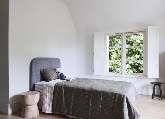
“Light-filled and spacious, this bedroom ticked all the right boxes, however, the room needed some personality and tactile elements to create warmth. You want your child to love spending time in their room – it should be somewhere they can escape, relax, read and play. The quickest and easiest way to switch up the mood is with colour,” says Leech.
Leech kept the big-ticket items in the room – the bed, bedhead and solid-timber bedside table, and focused on updating the room with bold colour. She chose shades that worked with the neutral tones in the foundation pieces and added in plenty of textures to dial up the cosiness.
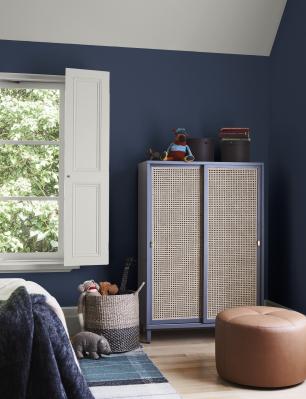
She started by adding deep blue, Dulux Wash&Wear in Winter Sea, to the walls and a gentle neutral, Dulux Vintage Linen to the ceiling and window detailing. “We opted for pale greige rather than a classic white for the ceiling and windows to soften the contrast with the blue. A sharp colour contrast can be very effective in a space, but in a room that’s all about relaxation, you want it to be a little less pronounced.
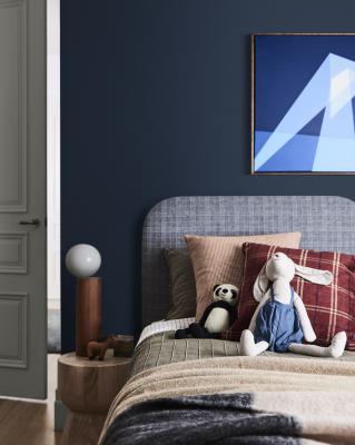
“Inky blue works well here – it’s cosy and timeless and sits beautifully alongside the natural materials in the room, such as the timber and woven-rattan. It also draws attention to and complements the artwork above the bed. I specified a matt paint finish to magnify the intensity of the blue.
“A woven wall hanging adds accents of rust and quirky bedside lighting creates a playful mood, adding contrast against the deep blue.
“To make the space feel more inviting, I layered the bed with cosy cushions and snuggly, fringed woollen blankets. Curvy furniture is a great addition to break the architectural angles in the room to make it feel more relaxed, while introducing pattern with a striped rug and crisp, striped bedding accentuates those added curves even more,” she says.
“For me, a rug is an essential in a bedroom; the floor is the first thing you feel when you get out of bed, so it needs to be soft.
“A rug also helps anchor the bed in the space. This one has dusty blue and stone hues, the latter being reflected in the finish of the cupboard.
“For the main artwork above the bed, we deliberately chose a piece that will work in the space as the child grows – a geometric abstract in various shades of blue. To personalise the bedroom, we framed and hung two of the child’s illustrations along with an artist’s fun print,” she says.
Leech created a place to read in a sunny spot by the window, complete with a velvet-upholstered armchair and a pair of side tables, perfect for keeping a book or two nearby. “Don’t be afraid to bring in pieces from another room, like this armchair, so long as they serve a purpose and fit with your colour palette,” she says.
“If you’ve been all about white for as long as you can remember, get a taste of using stronger colours by starting with a single wall – say the wall behind the bed,” says Lucena-Orr. “It will not only make a feature of your bed, however, will create an opportunity for any artwork to pop. This can also stretch your new confidence into using colour elsewhere in your home.”
BREE’ KIDS’ BEDROOM STYLING TIPS
Invest in quality: Kids are tough on furniture, so it’s worth paying more for well-made pieces that will last. You can save money on smaller items, such as bedlinen, art prints and rugs.
Add an upholstered bedhead: It makes for a comfortable spot to sit up and read.
Size it right: As a guide, when choosing a rug for a child’s bedroom it should fit two thirds under the bed and extend at least 30 centimetres beyond the sides of the bed – any smaller and it will look lost in the space.
Think multi-purpose: Children’s rooms are often small, so seek out flexible pieces that can be used in different ways, such as an ottoman that doubles as storage and seating.
Make storage easy: Add in baskets for toys and cupboards or shelves to hide mess away.


